Model Mapper for Predicted Species Density / Occurrence Online Help
Table of Contents
Quick Start
The Model Mapper has been developed by OBIS-SEAMAP hosted by Marine Geospatial Ecology Lab, Duke University with contributions from partners. As the Model Mapper is a platform for different projects, models or products, its implementation differs by project. Below are the currently supported projects/products. Most of the features described in this help are commonly available to all the projects but the interface and details may be different. The descriptions and screen shots are based on the Cetacen Density project.
| Project | Acronym | Product | Model Mapper URL | Links |
|---|---|---|---|---|
| Marine Mammal Density for the U.S. Atlantic | EC |
Predicted density | https://seamap.env.duke.edu/models/mapper/EC |
|
| NOAA Cetacean and Turtle Density for the Northern Gulf of Mexico | GOM |
Predicted density | https://seamap.env.duke.edu/models/mapper/GOM |
|
| Navy Marine Species Density Database for U.S. Pacific & Gulf of Alaska | PACGOA |
Predicted density | https://seamap.env.duke.edu/models/mapper/PACGOA |
|
| Marine Mammal Density for the California Current Ecosystem & Baja | CCE |
Predicted density | https://seamap.env.duke.edu/models/mapper/CCE |
|
| Cetacean Density for the Arctic | Arctic |
Predicted density | https://seamap.env.duke.edu/models/mapper/Arctic |
|
| NUWC Sea Turtle Density for the Atlantic | NUWC_EC |
Predicted density | https://seamap.env.duke.edu/models/mapper/NUWC_EC |
|
The Mapper has two editions: Standard (STD) and Professional (PRO). This help describes the features mainly based on the STD edition of the Mapper but additional features for the PRO edition are also described. The differences between the STD and PRO editions are noted with a mark [STD] or [PRO].
![Start by clicking [Select Model] button](/html/help/dsm/images/lets_start.png)
Follow the steps below to show species data and statistics.
- Go to the Model Mapper (see the above URL).
[PRO] To access the PRO edition, add "/PRO" at the end of the URL above. - Click [Select Models] located at the center of the map. It opens up the Select Models window showing the list of models available.
- In the Select Models window, Click one of the species / guild to display the layer(s) on the map.
- The models are grouped by species/guild ([PACGOA] The models are also grouped by study area). The species/guild are further grouped by larger groups. Larger groups for the predicted density models: Small delphinoids / Large delphinoids / Beaked and sperm whales / Baleen whales.
- Each species / guild has information regarding region ([EC] & [GOM]: only one region) and temporal period the density was estimated for.
- If the species / guild you selected has layers in multiple regions listed, layers for these regions are shown on the map.
- If you want to display just one of the regional layers, click the thumbnail for that region.
- For those assessed at a finer temporal scale (usually monthly) than annually, select the month or season you want to visualize from the dropdown.
- Not all species have models for multiple regions.
- Not all projects have more than one regions.
- You can select multiple species or regional layers by holding CTRL key down. Any combination of species/regional layers is possible (e.g. all species in the Beaked and sperm whales group; fin whales and humpback whales and in the EC region).
- Click the close button at lower right corner of the Select Models window.
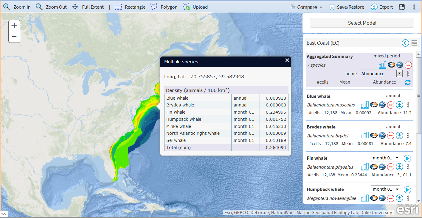
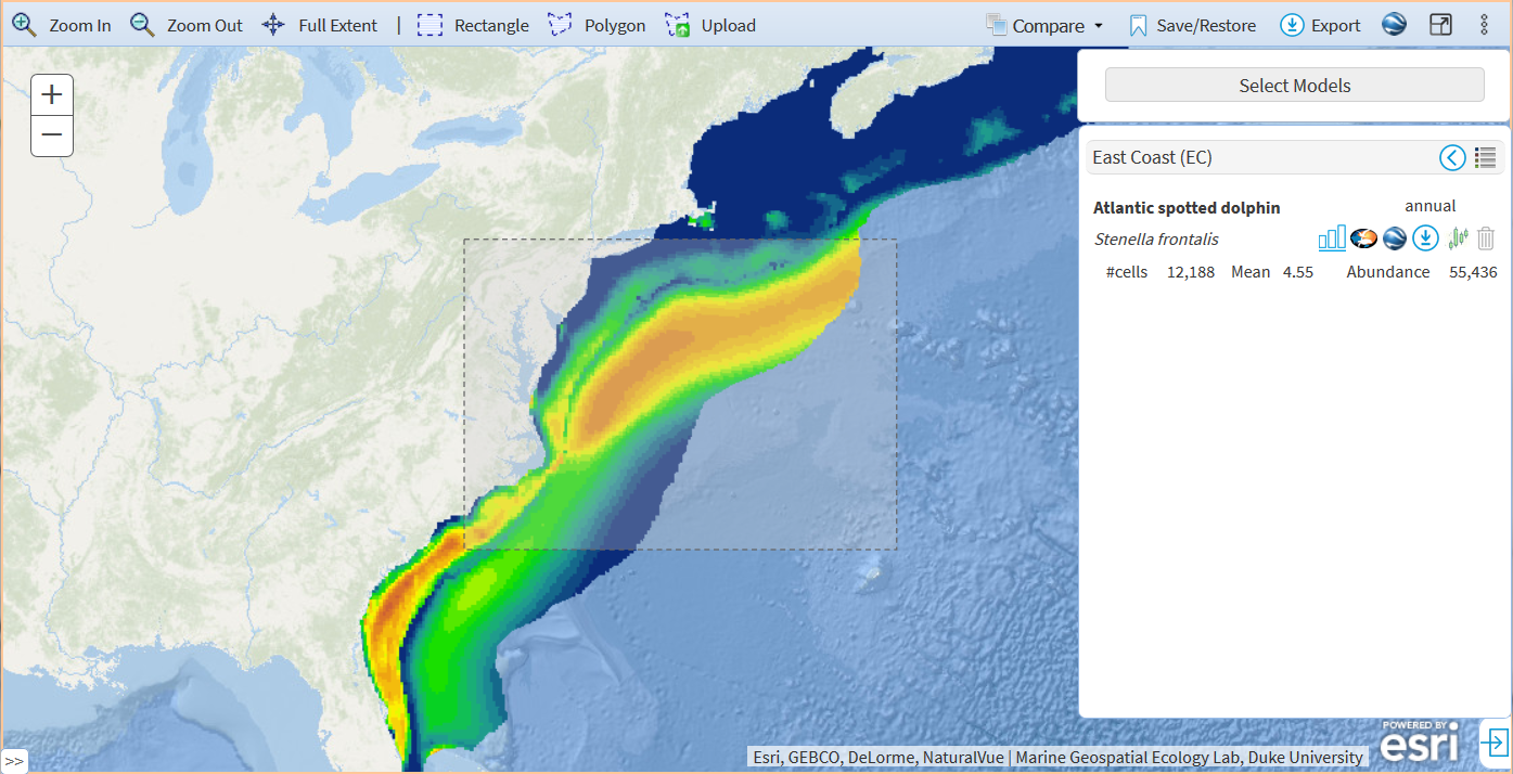
- All information and available features are packed in the Information Panel per region.
- If you chose multiple species, the data are aggregated into a "Aggregated summary".
- Click the chart icon. This may take a few minutes to finish with multiple species / regional density layers selected. The chart window will show up.

- [EC & GOM] You can select all species for the same region by clicking "Select all".
- [EC & GOM] There are two views of the models. By default, models are displayed in a card style. You can switch to a list style to see simplified list of models.
- [EC & GOM] In the Density Mapper for EC and GOM, species are not grouped by study area.

- [STD] The OBIS-SEAMAP icon and Google Earth icon are not available.
- [PACGOA & CCE] The Download and OBIS-SEAMAP icons are not available in either STD or PRO edition.
- [PACGOA] The Uncertainty icon is not available in either STD or PRO edition.
Interface Overview

- [PRO] The following buttons/features are available for PRO edition only.
- Save/Restore in the toolbar
- Three-dot Map Options in the toolbar
- [EC] OBIS-SEAMAP icon in the Map Info Panel
- Google Earth icon in the Map Info Panel
- [EC] Download icon in in the Map Info Panel
When a model layer is visible, you will see the output value (e.g. binned animal density) of the location where the mouse is pointing at. This is called "Active Legend". When you move the mouse, the Active Legend popup follows the mouse and continuously updates the output value in the popup.
Select Models Window
Species Groups / Guilds
Species are grouped as follows:
- Baleen whales
- Beaked and sperm whales
- [Arctic] Beluga
- Large delphinoids
- [Arctic] Pinnipeds
- [PACGOA & CCE] Porpoises
- [PACGOA & GOM] Sea turtles
- [PACGOA] Seals and Sea lions
- [EC] Seals
- Small delphinoids
There is also ESA/IUCN-listed species group.
The Select Models window shows available model layers per species. You have three ways to select the model layers to visualize them on the map (see the screen shot above).
- Click on the species illustration: If the species has multiple model layers in different regions (e.g. the Atlantic and the Gulf of Mexico), these layers are added onto the map.
- Click the thumbnail of the regional model layer: The selected regional layer is added onto the map.
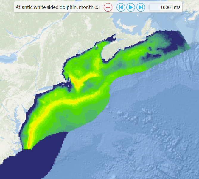
- Select a month from the dropdown: If the model layers were generated monthly, you can select one of the months from the dropdown. If there are no monthly layers, no dropdown is available and it's labeled as "annual".
You can choose multiple species or regional model layers by holding [CTRL] key (in Windows) down. Any combination of species is possible, even across different species groups. The layers from multiple species in the same region (e.g. the Atlantic) are "mosaicked" or merged through the pre-defined calculation (e.g. adding up or taking mean of the model values at the same location) and it is presented as an "Aggregated Summary" layer on the map and in the Information Panel.
Information Panel
The Information Panel is the main panel to control the model layer on the map. The Information Panel is grouped by region. Once the model layer is selected, the species information, summary statistics of the model outputs and actions/features available to the model layers are provided in the panel.
Each layer is equipped with the following features (the availability of the features differ among projects):
Icon |
STD | PRO | Description | |
|---|---|---|---|---|
Y |
Y |
Display chart of the model outputs. See below for more details. | ||
N |
Y |
[EC] Upon a click on the icon, by default, species sighting data held in the OBIS-SEAMAP database will be presented on the OBIS-SEAMAP Advanced Search. A new tab/window for the Advanced Search will open up. Alternatively, you can display the OBIS-SEAMAP sightings on top of the model layer. To do so, go to the map options panel (click the three-dot options icon in the toolbar) and choose "Overlay data on the map" from "OBIS-SEAMAP Data Options". You can choose gridded summary or points by selecting the corresponding option. To hide the OBIS-SEAMAP sightings for the species, click again the icon. Notes:
|
 Sightings from OBIS-SEAMAP on top of the fin whale density |
|
N |
Y |
Load the model layer on Google Earth. If species has more than one layers (i.e. 12 monthly layers), all of them are loaded into Google Earth. When you click this icon for the Aggregated Summary, all species included in the current aggregation are loaded but they are not merged. Notes:
|
 Fin whale density on Google Earth |
|
Y |
Y |
Download a zipped file including raster files for the model layers and supplemental materials for the species referred to by the paper. Notes:
|
||
Y |
Y |
Start the animation. This icon is presented when the species has monthly or seasonal layers. Through the animation, each of the monthly or seasonal layers is displayed on the map at a changeable interval (default: 1,000 milliseconds or 1 second). To change the interval (animation speed), enter the number in milliseconds into the textbox and hit the return key. The larger the number is, the slower the animation goes. The suggested fastest animation is at 100ms. You can pause the animation and move forward/backward by hand. To finish the animation and go back to the previous view of the map, click "Exit animation" button. Notes:
[PRO] The animation is available for one model layer at a time. In the PRO edition, the OBIS-SEAMAP layer will be also included in the animation. |
 |
|
Y |
Y |
Delete the model layer in the region. When you click this icon for the aggregated summary layer, all species chosen will be deleted as well. | ||
Y |
Y |
The supplemental layers are provided including CV, Standard error, 5/95 percent CI depending on the models. By clicking this icon, you can choose one of them to overlay it on the density layer. This icon is visible when only one model is selected. |
Symbology, Color Ramp and Legend Section in Information Panel
The Symbology, Color Ramp and Legend Section will be expanded when the legend icon in the Information Panel is clicked. This section shows symbology, color ramp and legend of the layer visible/selected on the map. In this panel you can also change the symbology and color ramp. The default symbology for the density layer visible on the map is one of the four pre-defined ones as:

| Symbology | #classes |
Value range |
|---|---|---|
| Highest density | 15 |
0 - 1000 |
| High density | 15 |
0 - 100 |
| Low density | 15 |
0 - 10 |
| Lowest density | 15 |
0 - 1 |
Additionally, you can choose the following symbology:
- Equal interval
- Quantile
- Jenks natural breaks
- Core abundance areas
For these symbologies except Core abundance areas, you can change the number of classes (default: 20). Note that Jenks natural breaks takes a long time to find class breaks (usually around 30 seconds depending on the server performance at that time).
For Core abundance areas, you can enter multiple integers from 0 to 100 as breaks in percent with a dash ("-") as a delimiter (e.g. 25-50-75). A core abundance area is defined as a high concentration area (an area of high density cells) that covers the specified percent of the species abundance.
For example, when you enter "50" (the default value) into the %breaks box, you will see the area that concentrates 50% of the species abundance.

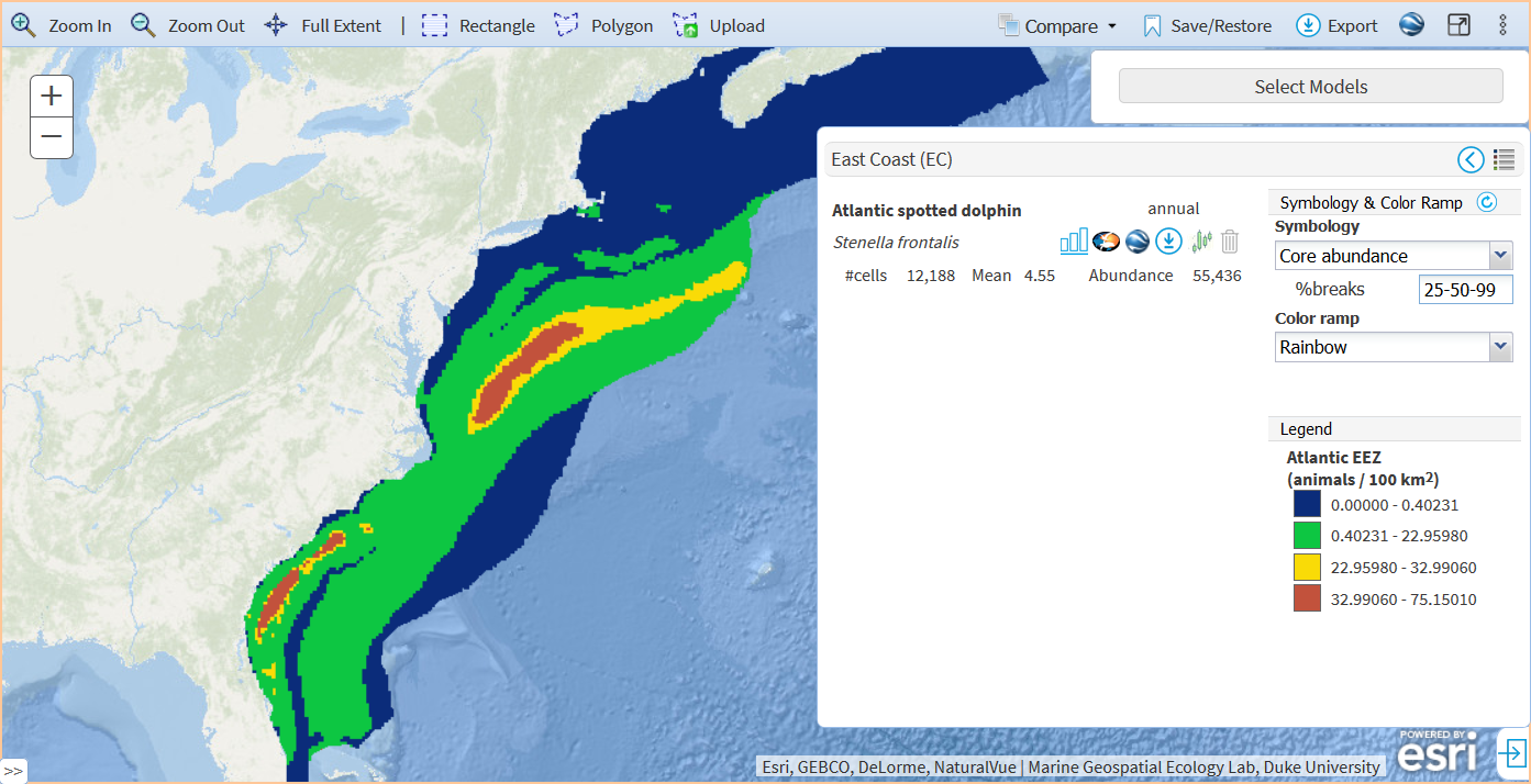
In the EC Mapper, there are 10 color ramps to choose from. The output values from high to low will be given colors from left to right.
| Color ramp | |
|---|---|
| Default 2022 |  |
| Rainbow |  |
| Viridis |  |
| Viridis Plasma |  |
| Viridis Magma |  |
| Darkblue |  |
| Grayscale |  |
| Cold to Hot |  |
| Yellow to Red |  |
| Darkgreen |  |
Notes:
- [PRO] The change of the symbology is only available with "Mosaic all layers" option. When the map option of "Render individually" is chosen, the selectable symbology options are not visible. See below for the mapping options.
Features & Functions Toolbar
Feature |
Description | |
|---|---|---|
Identify |
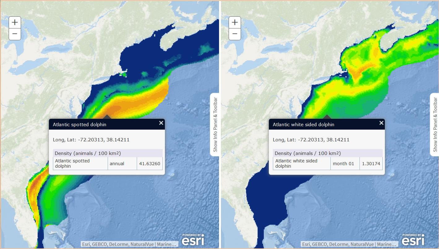
Identify is the default operation for the map. You don't need to click a button to activate it when no other button is pressed.
By default, a popup shows up including the information (e.g. density value) of the location you clicked. [PRO] The feature below is available for PRO edition only. You can switch to "Show enlarged insets" option available in the Map Options Panel. This option shows a small, zoomed-in area of the location you clicked. This is most useful when multiple layers are selected. Then, zoomed-in layers of all of the selected species are displayed along a line or a circle. Notes:
|
|
Zoom in |
To zoom in to an rectangular area:
Notes:
|
|
Zoom out |
To zoom out to an rectangular area:
Notes:
|
|
Full Extent |
To return to the initial extent:
|
|
- or -
|
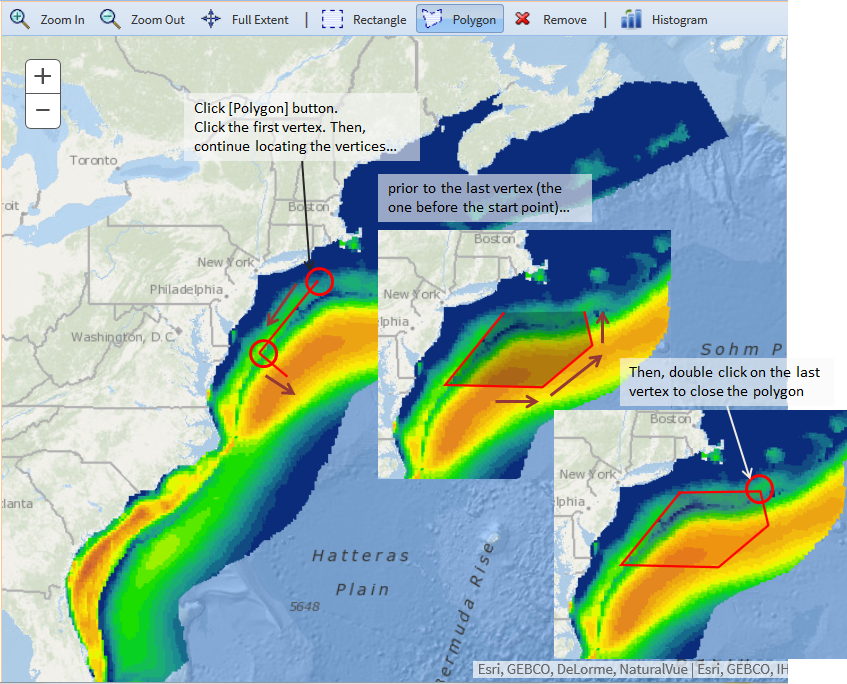
A region can be drawn on the map to define your study area and you can obtain regional statistics of the model. You can draw a rectangular or polygon region on the map. To draw a rectangle on the map,
To draw a polygon on the map,
Notes:
|
Rectangle drawing
|
Upload |
You can upload a zipped shapefile as an ROI.
Notes:
|
 |
Remove |
To remove the rectangle or polygon drawn on the map:
Notes:
|
|
Layers |
[PRO] This button is available for PRO edition only. By clicking the button, a popup window shows up where you can choose the base map or turn on / off additional layers on the map. In addition to the pre-defined layers, you can also overlay layers from external services served through ArcGIS Servers. Basemaps: There are four choices of the basemap for the Web Mercator projection. The default one is "Oceans". The other choices are "Terrain", "Gray" and "Satellite". Click one of them to change the basemap. The geographic coordinate system has two choices for the basemap. The other projections does not have choices other than the default gray basemap. Pre-defined layers & External Services: See "Managing Layers" section below. |
 |
|
You can compare two layers side by side. For example, it is interesting to compare different months for the same species or two biologically close species.
[PRO] The following feature is available for PRO edition only. Another way to compare two model layers is to overlay them.
See "Comparison of two layers" for more details. |
 |
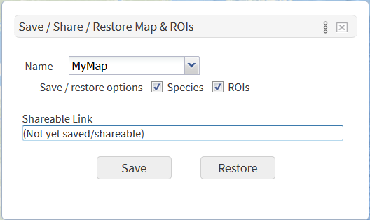
Save/Restore |
[PRO] This button is available for PRO edition only. You can save the current map settings (e.g. species selected, ROIs drawn, symbology and color ramp chosen) and recall them in a later use. In addition, you can share your map settings with others. To do so, follow the steps below.
Once you saved the map, a shareable Link will be placed in the corresponding box. You can copy the link and send it to collaborators. You can get the sharable link any time by opening the Save popup and choose the name you want to share. |
|
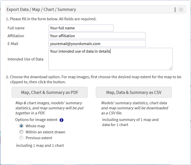
Export |
Once you explored model outputs and got the maps and charts that you wanted to use for your work, you can export them as a PDF. Map images and chart images (if visible on the browser), summary statistics and map information as well as a copy of Terms of Use are put together in a PDF. The images in the PDF are clickable to download as a PNG file. You can also export the summary statistics and map information as a CSV file which is ready to load into Microsoft Excel. To export the map, follow the steps below.
Notes: The information entered in the form is archived in the OBIS-SEAMAP database. Your contact information will never be released to the public without your consent but we may use the information to summarize the activities on the Mapping Tool. |
|
Google Earth |
This feature takes a snapshot of the current map and gets it rendered on Google Earth. The current symbology, color ramp and spatial filtering are reflected. This is most useful when multiple models are selected and an aggregated summary is shown on the map. Additional layers such as backgrounds and OBIS-SEAMAP layer will be also taken in the snapshot. This is a different feature than the Google Earth icon in the Information Panel where the pre-configured model layer is added on Google Earth. Notes:
|
 An aggregated summary of Atlantic spotted dolphin and Atlantic spotted dolphin color-coded with the Viridis along with OBIS-SEAMAP point observations for these species on Google Earth |
Fullscreen |
To enlarge the workspace, you can go to the fullscreen mode. The fullscreen mode hides the header, toolbar, Map Info panel. To show the toolbar, move the mouse to the top of the screen. The toolbar will slide down immediately. To show the Information Panel, click "Show Info Panel & Toolbar" button at the right of the screen. To hide it again, click "Hide Info Panel & Toolbar" at the lower right of the screen. |
|
Map Options |
[PRO] This button is available for PRO edition only. Map Options allow you to explore models in depth. Currently, there are 6 groups of options.
See details in "Map Options" section below. |
|
Switch to PRO |
[STD] This button is available for STD edition only. If you have found you need features that are available only in PRO edition while exploring the model outputs in STD edition, click this icon. You will be forwarded to PRO edition with all layers, polygons, calculated summary statistics and other map settings automatically restored in PRO edition. |


Exploring Model Output with Chart
One of the essential features of the Model Mapper is to draw an interactive chart that give users non-spatial representation of the model output. By default, a histogram is generated that calculates frequency of cells over binned values (density or encounter probability) of the model output. To do so, click ![]() in the Information Panel (see the screen shot above).
in the Information Panel (see the screen shot above).
The x-axis of the histogram is the value of density or encounter probability. The values are split into bins whose size is automatically determined based on the value range and the number of bins which is 20 by default. The y-axis on the left is the frequency or the count of cells within each bin. For the density model, a line chart is added and a corresponding y-axis is presented on the right This line shows the cumulative population that sums the number of animals per cell from the lowest density cells to the maximum.
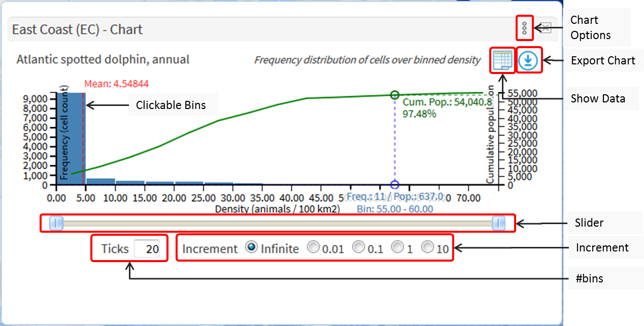
The histogram is interactive in that it allows you to see where a specific value range set on the histogram corresponds to on the map. To find a portion of the model layer where output values fall in a range of your interest, you can either slide the slider thumbs to define a range of any values or click on a bin to choose the density range corresponding to that bin. You can choose multiple bins side by side by pressing [SHIFT] key down. To reset or cancel the filtering, click on one of the red bins.
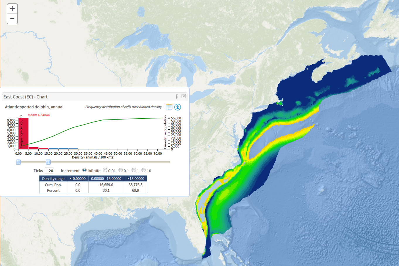
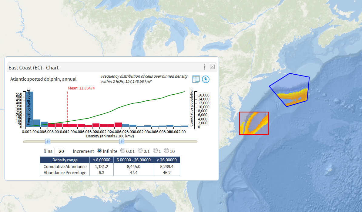
When ROIs (rectangle or polygon) are drawn on the map, the histogram is generated based on the model outputs within the ROIs. The filtering using the histogram bins or thumbs will specify the corresponding cells just within the ROIs.
- The generation of histograms of the model layer within the ROI(s) takes a much longer time than that for the layer without ROIs as the former needs to run the server-side script to extract layer values within the regions whereas the latter can use a cached data.
- When the region is removed, the histograms are cleared. You need to recalculate the summary statistics.
- When multiple regions are drawn, the density values within these regions are merged to generate a single histogram.
Chart options described below help you investigate the model outputs further. For example, you can change the bin sizes and colors so they match the symbology and color ramp of the model layer. You can add other lines such as "cumulative population (reverse)" that give you an overview of abundance change.
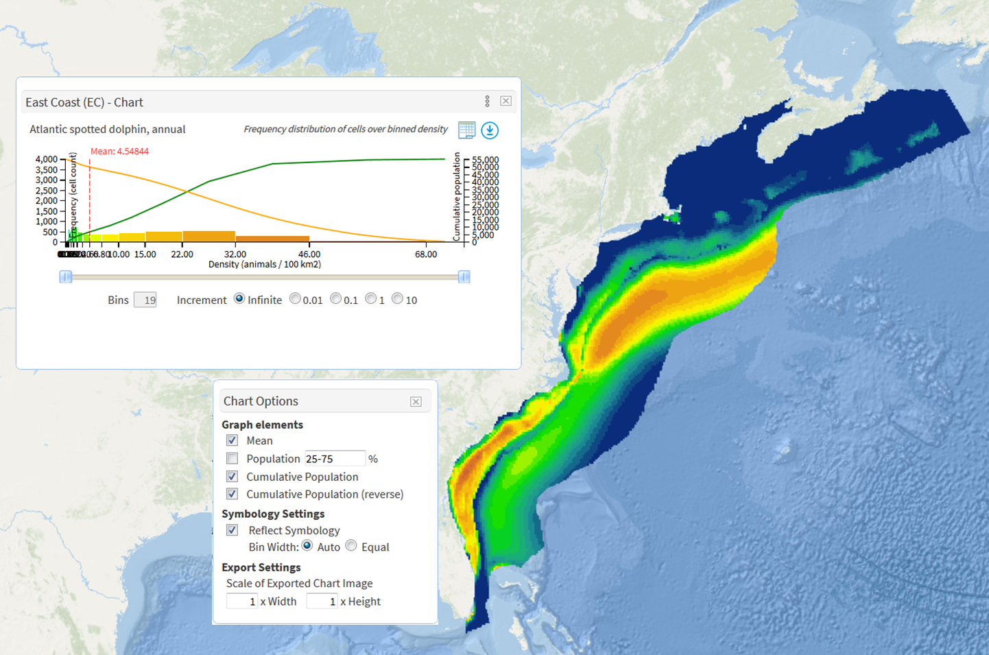
- With "Reflect Symbology" option is checked, bin sizes and colors match the symbology and color ramp of the model layer.
- When "Cumulative Population (reverse) is selected, a curved orange line is added to the histogram. The reverse indicates the abundance of cells are added up from the highest density cells toward the lowest density cells.
Chart Options
| Feature | STD |
PRO |
Description |
|---|---|---|---|
| Clickable Bins | Y |
Y |
All bins are clickable to select and define a value range. To select multiple bins next to each other, hold [SHIFT] key down when users click a bin. The value range defined is reflected on the map by filtering the model output by the value range. To deselect a selected bin, just click the bin again. Similarly, to clear the value range, click one of the selected bin. |
| Show Data | N |
Y |
Show the data used for the chart in a tabular format below the chart |
| Export Chart | N |
Y |
Export the chart as a PNG image as it is |
| Slider | Y |
Y |
Alternative to clicking bins, users are allowed to move the two slider thumbs to define the value range which will be reflected on the map by filtering the model output by the value range. |
| #bins | Y |
Y |
The number of bins. The default is 20. Note users may see a different number of bins actually produced due to the outcome of the calculation. |
| Increment | Y |
Y |
The increment of the slider thumbs when users move them. By default, it is infinite meaning users can move the thumbs freely. Numeric increments define the stepping stones on which thumbs move to. This way, it is convenient to define a range with exact values. For example, if users chose "1", the thumb slides from 0 to 1 to 2 etc. If users chose "10", the thumb slides from 0 to 10 to 20 etc and in this case users can't define a range like 5.5 to 10.5. |
| Chart Options | Y |
Y |
Display a popup that allows users to choose various options |
| Chart Options Popup | |||
| Mean | Y |
Y |
Flag to show or hide a dotted, vertical line that indicates the mean value of model output. |
| Population | N |
Y |
Flag to show or hide dotted, vertical lines that indicate the density above which encompasses the ratio of population specified in the textbox. Users can specify multiple percentages with a dash as a separator (e.g. 20-40-60-80). For example, the default ratios "25-75" draw two vertical lines. The right-most line indicates the density value above which 25% of population concentrates. The left-most line shows where 75% of population is encompassed. |
| Cumulative Population | Y |
Y |
Flag to show or hide a line chart that displays cumulative population counting animals from the minimum density cells. |
| Cumulative Population (reverse) | N |
Y |
Flag to show or hide a line chart that displays cumulative population counting animals from the maximum density cells. |
| Reflect Symbology | Y |
Y |
Flag to set sizes and colors of bins according to the current symbology and color ramps. By reflecting symbology, it will be more intuitive to see which density or encounter probability range (each bin) corresponds to which area. There is one possible issue where width of some bins would be too narrow to see. Then, users can choose "Equal" option for the Bin Width. With the Equal option chosen, be aware that the x-axis of the model output could be severely skewed. |
| Scale of Exported Chart Image | N |
Y |
By default, the Export Chart feature exports the chart as an image with the same size as users see on the browser. Users can change the size of exported image by changing the scale. Either width or height or both can be specified. For example, entering 2 to width and height doubles the size of image. By changing the height to 3 while keeping the scale of width 1, the exported image enlarges three times only vertically. |
Advanced Use
Overlaying model layers from multiple species
As touched above, you can choose multiple species to display the model layers on the map.
The model layers you chose in the same region are mosaicked by summing up the output values over overlapping cells.
The mosaicked layer is called an "Aggregated summary" and added to the Information Panel.
The summary statistics are not calculated automatically and you have to click "Recalculate stats" icon ![]() which may take several seconds. This is useful to see an estimated abundance or density for marine mammals in question in your study area for decision support or management purposes.
which may take several seconds. This is useful to see an estimated abundance or density for marine mammals in question in your study area for decision support or management purposes.

When you click on the Aggregated summary layer, you will get the aggregated cell value along with the cell value for each of the species overlaid. In the chart window, the histogram is generated based on the mosaicked layer with the same aggregation (addition or mean of model outputs) and you can explore the interaction between histogram and the layer the same way (choosing bins, changing bin colors etc) as for a single species.
Managing Layers
You can choose the basemap or turn on / off additional layers using the Layers popup. In addition to the pre-defined layers, you can also overlay external resources served through ArcGIS Servers.
< Basemaps >
There are five basemaps. Simply click / choose the one you want to see. The availability of the basemaps varies depending on the current map projection.
| Basemap | Default | Availability |
|---|---|---|
| Oceans | Y for Web Mercator | Web Mercator |
| Terrain | N | Web Mercator |
| Topo | N | Geographic |
| Gray | Y except for Web Mercator | All projections |
| Satellite | N | Web Mercator |
< Pre-defined layers >
There are five pre-defined layers. You can change the opacity of the layers except "Boundaries and labels". Opacity of 1 is completely opaque. Opacity of 0 is completely transparent. You can also turn on / off the fill of the polygons. When you turn the Fill option off, the layer is rendered with outline only.
| Layer | Source | Opacity | Fill |
|---|---|---|---|
| Boundaries and labels | ESRI World Ocean Reference | N |
N |
| Continents | ESRI countries | Y |
N |
| EEZs | Maritime Boundaries (version 10); marineregions.org; Flanders Marine Institute (2018) | Y |
Y |
| MEOW | Marine Ecoregions of the World (2007); Spalding et al. (2007) | Y |
Y |
| Bathymetry | ETOPO2 | Y |
N |
< External Services >
In addition to the pre-defined layers, you can also overlay layers from external services served through ArcGIS Servers. The URL of the external resource is needed. It should look like:
https://coast.noaa.gov/arcgis/rest/services/MarineCadastre/BoundariesAndRegions/MapServer/ (Boundaries and Regions resource by NOAA)
|
To overlay an external layer, follow the steps below.
|

|

- Once you chose the external layer to overlay and the layer was drawn on the map, you can click one of the polygons and see the details of the polygon.
- In the popup window, there is a link "Add as ROI". This link allows you to add the polygon you clicked as a region of interest (ROI) which will be treated in the same way as for the rectangle or polygon you would draw by hand.
- Thus, you can calculate the summary statistics within the polygon from the external resource and draw a histogram.
Map Options - PRO only
Map Options allow you to explore models in depth. Currently, there are 7 groups of options. The Map Options panel will be shown by clicking on the three-dot icon in the toolbar.

| Option | Description |
|---|---|
| Mapping Options | Multiple selections for projections. [EC] Two options to specify how the multiple model layers are overlaid. To dispay a scalebar at the borrom-left of the map. To change the density layer's opacity. |
| Summary Statistics | Two options to specify how to calculate the statistics when multiple ROIs are drawn. |
| Identify Options | Two options to specify how the output of the Identify feature is displayed. |
| OBIS-SEAMAP Data Options | [EC] Two options to specify how the OBIS-SEAMAP data are visualized. |
| Legend Options | To activate "Active Legend". By default, it is activated. |
| Layers | Additional layers available to overlay. |
| Basemap | Choices of basemap. |
Mapping Options
By default, the model layers you chose in the same region are mosaicked by summing up the output values over overlapping cells.
The mosaicked layer is called an "Aggregated summary" and added to the Map Information Panel. The summary statistics are not calculated automatically and you have to click "Recalculate stats" icon ![]() which may take several seconds. This is useful to see an estimated abundance or density for marine mammals in question in your study area for decision support or management purposes.
which may take several seconds. This is useful to see an estimated abundance or density for marine mammals in question in your study area for decision support or management purposes.
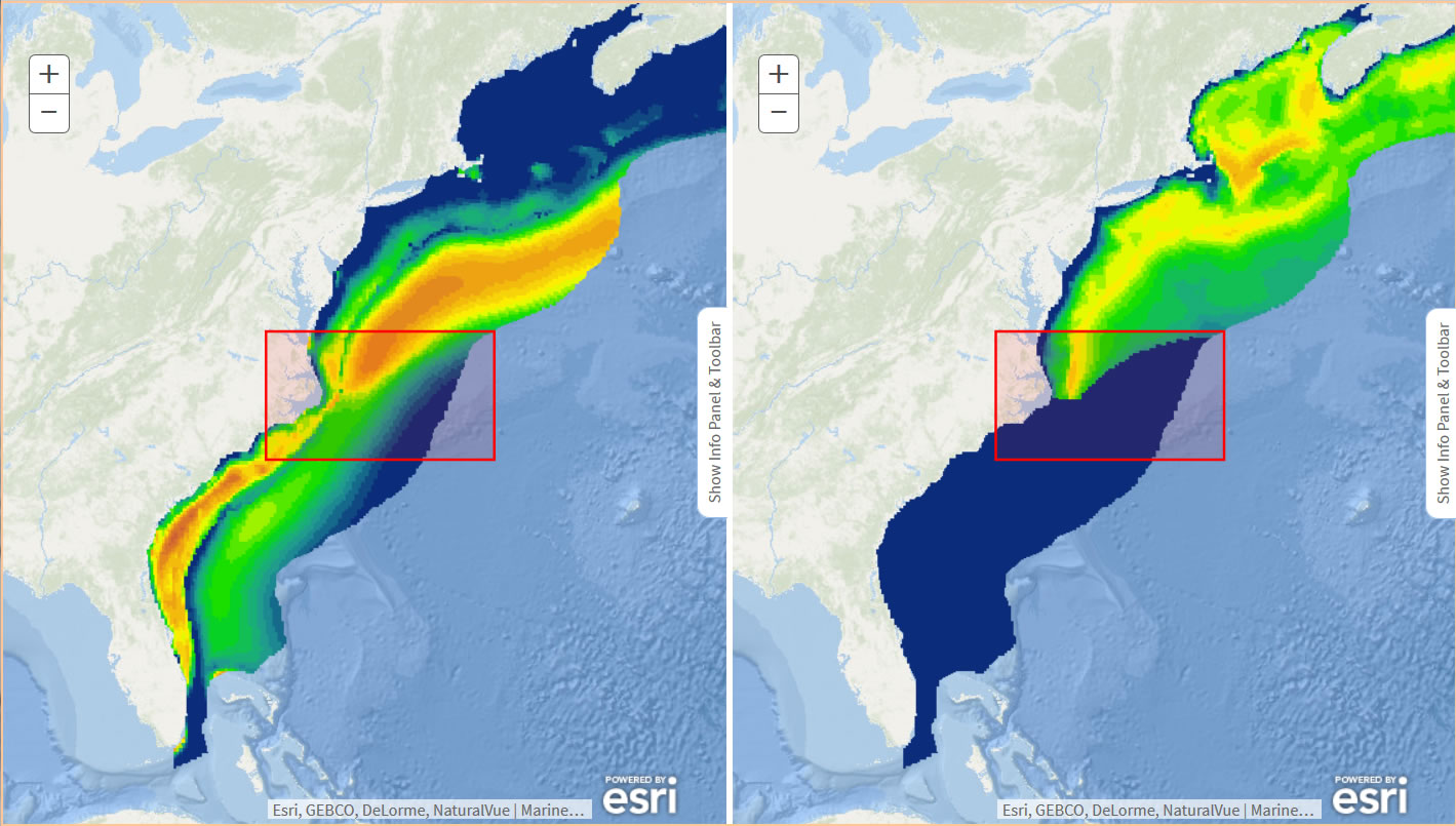
The Render individually option simply overlays the selected layers without mosaicking. "Aggregated summary" layer is not produced and not shown in the Map Information Panel. Thus, you see only one of the layers at a time and you can switch which layer / species to see by choosing the species in the Information Panel. This is useful to do analytical tasks on a single species or compare estimated abundance or density of multiple species.
The choice of the mapping option affects how charts are generated and what information the Identify tool returns. See below for more details.
== Projections ==
There are several projections you can choose from. Exact selections vary per project. The following is the example for EC.
- Web Mercator (default)
- Geographic
- Albers Equal Area
- North Pole Lambert Azimuthal Equal Area
- North Pole LAEA Alaska
- South Pole Lambert Azimuthal Equal Area
- World Mollweide
When you switch the projection, the current species/layers on the map will be persistent in a new projection. ROIs are also preserved but the size of them may change as a result of reprojecting processes. Hence, the summary statistics, which is cleared when switching the projection, may not be always same among projections.
== Mosaic all layers ==
In this mode, all model layers are merged or mosaicked by summing up the output values over overlapping cells. The histogram is generated based on the mosaicked layer. To investigate how individual species contributes to the mosaicked layer, you can select one of the species in the Map Information Panel. The histogram of that species will be displayed in the Chart Panel. Multiple charts can be viewed by scrolling the Chart Panel.
== Render individually ==
In this mode, all model layers are overlaid but not merged. Thus, you will see only one of the layers on the map at once. You can see which layer is active (highlighted) in the Information Panel. The histograms are generated per model layer and by default you will see the one for the species highlighted in the Panel. You can select one of the species in the Panel to switch the model layer on the map and histogram.
== Opacity ==
For the model layer, you can change the opacity of the layer so that you can see through the layer underneath (e.g. bathymetry). There is an option regarding when the opacity change takes effect. With "On mouse down" option checked, the see-through function turns on in about 1.5 seconds when you mouse-down somewhere on the map. This function is followed by the Identify tool so that you can get the information of the layers (e.g. density value and the bottom depth) while seeing the layer beneath.

== Show Scalebar ==
Check this otpion to show a scalebar at the bottom-left of the map. Scalebar's unit is kilometers.
Summary Statistics
When multiple ROIs are drawn on the map, you can choose how to calculate the summary statistics. By default, all ROIs are merged before calculating statistics. So, you get a single value of species abundance within all ROIs combined.
If you choose "Calculate per ROI", in addition to the stats for all ROIs combined, you will get stats for each ROI. To see all stats, click the left arrowhead icon ("Show full set of summary") to expand the Map Information Panel.

Identify Options
The Identify feature displays the information of the layers on the clicked point in a popup window. There is an alternative way to visualize the layers at the point of the click. With "Show enlarged insets" option on, the zoomed-in look of the layers at the clicked point is displayed around the point. See more details in the Features & Functions Toolbar section.
OBIS-SEAMAP Data Options - [EC] Only
Investigating how model outputs are representative to actual animal sighting data will be an interesting viewpoint while using the Model Mapper. Clicking the OBIS-SEAMAP icon ![]() opens up a new window/tab that displays the OBIS-SEAMAP Mapping Tool with the species sightings loaded automatically. If you would like to display sightings over the model layer, check "Overlay data on the map" on.
By default, the OBIS-SEAMAP data are aggregated at a certain spatial resolution (e.g. 1 degree) and the outcome is a gridded summary. You can switch to "Points" option that displays individual sightings as points. Currently, the OBIS-SEAMAP data are not split by region. You will see, for instance, sightings in the Gulf of Mexico as well when you click the OBIS-SEAMAP icon for the model in the east coast.
opens up a new window/tab that displays the OBIS-SEAMAP Mapping Tool with the species sightings loaded automatically. If you would like to display sightings over the model layer, check "Overlay data on the map" on.
By default, the OBIS-SEAMAP data are aggregated at a certain spatial resolution (e.g. 1 degree) and the outcome is a gridded summary. You can switch to "Points" option that displays individual sightings as points. Currently, the OBIS-SEAMAP data are not split by region. You will see, for instance, sightings in the Gulf of Mexico as well when you click the OBIS-SEAMAP icon for the model in the east coast.
Please note that OBIS-SEAMAP archives a portion of, not a full set of, the data used for the modeling work for the EC project. When you first check "Overlay data on the map" on, you will get a note about this.
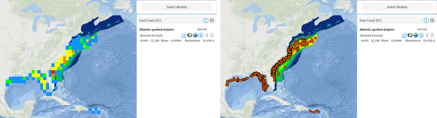
- The gridded summary (left) aggregates sightings at a certain resolution which starts from 1 degree at a wider view to 0.01 degree at a zoomed-in view.
- The points layer (right) displays individual sightings as a point.
Legend Options
By default, when you mouse over the model layer, you will see a floating popup showing the value of model output at the location of the mouse. This feature is called "Active legend". If you don't need to see the floating popup continuously, turn off "Active legend". Alternatively, you can place the popup at the left bottom corner of the browser window by checking "Fixed at bottom".
Comparison of two layers
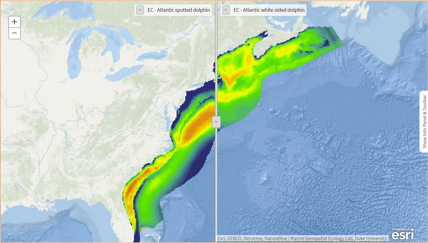
Side by sideThe Model Mapper provides a way to compare two layers (model outputs) side by side. This feature is useful to look over the species density for different months or compare the density of two different, but biologically close species.
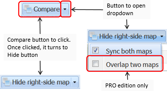
To compare two layers, click [Compare] button in the toolbar. The left and right sides of the map provide the same functionality available in the toolbar and display the same Map INformation Panels.
You can also make the two maps synchronized. To do so, click the right side of the [Compare] which displays a dropdown having "Sync both maps" option. Check this option on. Usage of the tools in the toolbar remains same and the action of one map will be replicated on the other map. For example, you can draw a rectangle region on the left-side map. Then, the rectangle is automatically copied to the right-side map.

Refer to the following table to see which tools/features are synchronized between the left and right side maps..
| Option | Sync |
Description |
|---|---|---|
| Species selection | No |
You can choose different species for the left and right sides of the map. |
| Zoom and pan | Yes |
When you zoom in/out or pan on either side of the map, the other side follows the action. |
| Draw / remove region | Yes |
When you draw a region on either side of the map, the region is copied onto the other side of the map. Removal of the region on one of the maps also happens in the other map. |
| Identify | Yes |
When you click a location on the left or right side of the map, you get the information on that side of the map as well as the information on the same location on the other side of the map. |
| Filtering | No |
Filtering features available for the histograms are applied to the density layers on that map that the histogram belongs to. |
[PRO] Overlay (swipe) one map on top of the other
Another way to compare two maps is to overlap model outputs on the right-side map on top of the left-side map. Then, with a vertical sliding bar, you can swipe (hide and display) the upper density layer over the lower layer. To enable the swiping feature,
- Click [Compare] button. The right-side map will show up.
- Select models for the left-side and right-side maps using [Select Models] button.
- Check on [Overlay two maps]. The model outputs on the right-side map are overlaid on top of the left-side map.
- Slide the vertical sliding bar toward left or right to display or hide the overlaying map.
- To terminate the overlay and go back to the two maps side by side, turn off the [Overlay two maps] checkbox.
Notes
- The overlap two maps feature always overlays the right-side map on top of the left-side map. It does not support the other way round.
- While the overlap two maps feature is on, you can't change the settings of the right-side map (e.g. change the species or symbology). The panels for the right-side map are hidden. To change the settings, first turn off the overlay two maps feature.
- While in this feature the right-side map uses the pre-defined symbology. If you have changed the symbology, it will be rolled back to pre-defined symbology before starting the overlay.
- When more than one models are selected in the right-side map, the active layer (highlighted in the Information Panel) will be the target layer for this feature. The aggregated summary is not available to overlay. You have to choose single species for the right-side map before starting the overlay.
- [EC] When the OBIS-SEAMAP observations are displayed on the right side map, they are also overlaid on the left side map. For the gridded summary of OBIS-SEAMAP layer, the grid size is fixed while the overlaps is underway.
- The Identify feature works on the overlaid layer when "Show info in a popup" option is selected. It does not display the insets of the overlaid layer when "Show enlarged insets" option is selected.
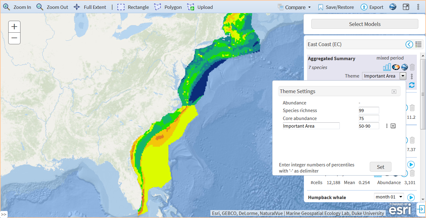
Themes for Aggregated Summary - PRO only
The PRO edition introduces themes for an aggregated summary. Themes define how to merge and visualize the model layers for multiple species. The default theme is "Abundance" where the multiple model layers are merged by summing up the cell values (e.g. estimated density). There are three pre-defined themes and you can add more.
| Theme | Threshold |
Description |
|---|---|---|
| Abundance | - |
Model layers are merged by summing up the cell values (e.g. estimated density) to produce the total density of the selected species. |
| Species richness | 99% |
A model layer for each species is first reclassified into two classes / areas so that 99% of the species abundance is grouped into the species occurrence area (the cell value turns to 1) and the remaining area is regarded as a species absence area (the cell value turns to 0). Then, those reclassified layers for selected species are merged by adding the cell values up. The result can be seen as the species richness of the selected species. |
| Core abundance | 75% |
The concept of the Core abundance theme is same as the Species richness theme. The only difference is the threshold, which is 75%. The area that covers 75% of the species abundance is reclassified as a core area (the cell value turns to 1). The remaining area is classified as a non-core area (the cell value turns to 0). All the model layers of selected species are merged by adding the cell values up. The result can indicate where the core abundance areas of multiple species congregate. |
| (Custom) | One or more percentiles |
You can create your own theme by giving a name and one or more percentiles that are used to reclassify the model layers.
To create a new theme:
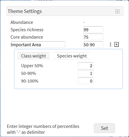 Once a theme is created, you can change the weight for each threshold / class or each species. To do so, click the three-dot icon next to the threshold box and you will see a table that lists thresholds and their weight ("Class weight") and a table that lists the species ("Species weight"). The class weight is the value that is given to each cell when the model layer is reclassified based on the thresholds. In the example of "Important Area", the cells classified as "Upper 50%" is given 2 and the mid threshold is given 1. If you think the "Upper 50%" area is critically important, you may want to give a higher weight, say, 4. The species weight is given to each species. By default, it is 1 for each species meaning all species are given the same weight / ranking. Changing per-species weight is useful when you want to put higher importance to a particular species (e.g. critically endangered species) than other species. |

Appendices
FAQ
- Is there a way to download everything (density layer, documents etc) at once?
- In the Information Panel, each species of EC has a download icon which allows you to download density layer, documents and uncertainly layers in a zipped file.
The same link can be found on the Repository page. There is also a link to download all species at once.
We do not have such links for PACGOA at this moment, though. - Can I have a direct link to the particular species?
- The Density Mapper accepts a couple of parameters including species name, region code and month.
The parameter format is:
?species=[species_name]®ion=[region_code]&period=[month]
where species_name is the species' scientific or common name. region_code is the region code (e.g. EC for the Atlantic) and month is the numeric month with the leading zero.
For example, the following URL loads the density layer of the humpback whale in August in the Atlantic.
https://seamap.env.duke.edu/models/mapper/EC?species=Megaptera%20novaeangliae®ion=EC&period=08
You can find these direct links on the Repository page, too. - What is the best way to use the density layers with ESRI products (e.g. ArcGIS Pro)?
- The most flexible way to use the density layers would be to download the data and load it into your ESRI products.
A quicker or more systematic way would be to access the layers through our REST API. See REST API below. - Can I display an Atlantic model and a Pacific model together?
- We do not provide a mapper that packs the Atlantic (EC), the Gulf of Mexico (GOM) and Pacific & Gulf of Alaska (PACGOA) models together.
However, all density layers are available through map services (REST API) and you can overlay them as external services (this feature is available on the PRO edition only).
See the Layers sub setcion in Map Options - PRO only for the instructions and see below for the REST API URL.
REST API
Notes on Statistics
The density is composed of unit cells (polygons) each of which holds a predicted density value. For EC models, the size of each cell is 5 km x 5 km and the density value is per 100km2. The cell size varies in PACGOA models which is displayed in the Model Information Panel.
When you define your study area and run the histogram tool, the statistics are calculated based on the cells picked up using ArcGIS Geostatistical Analyst Tools - Simulation - Extract Values to Table.
- The cells that fully or partially fall within your study area are extracted. Geospatial calculations are executed under the North America Albers Equal Area Conic projection (SRID: 102008).
- The density values of these cells are picked up using ArcGIS Geostatistical Analyst Tools - Simulation - Extract Values to Table and summarized as a histogram.
- The mean value is calculated by:
- Add density values for all cells that fall within the study area.
- Divide the total density value by the number of cells picked up.
Contributors
| [EC] | [PACGOA] |
|---|---|
|
Northeast Fisheries Science Center / NOAA Fisheries Southeast Fisheries Science Center / NOAA Fisheries Department of Biology and Marine Biology / UNC Wilmington Virginia Aquarium & Marine Science Center
|
Southwest Fisheries Science Center / NOAA Fisheries ManTech International Corporation Bureau of Ocean Energy Management
|

Previous model revisions
Before 2022, the models in EC and GOM were placed together in the previous revision. These models are available at the Density Mapper ver. 2019.
Cetacean Density for the U.S. Atlantic and Gulf of Mexico has a previous revisions for the models produced in 2015. These 2015 models are available at the Density Mapper ver. 2015.